

ALLIED HEALTH · REBUILD · 2026
No testimonials. No before-and-afters. No promises.
Live Free Health is an AHPRA-regulated practice, which rules out most of what websites normally use to win trust. So we built it from the things that were left: specificity, transparency, and commitments the team can actually keep.
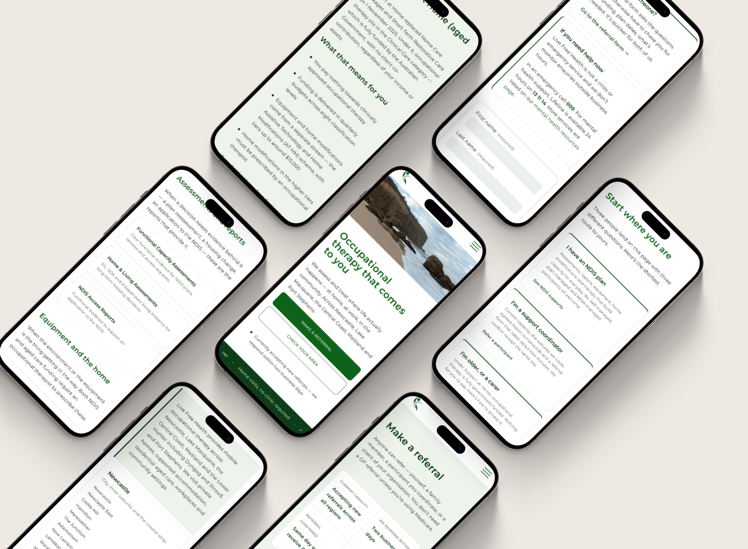
A good practice behind a quiet website
Live Free Health was already working — a team of occupational therapists covering five regions, with a Squarespace site that looked perfectly decent.
Looks weren’t the problem. Page titles were generic and meta descriptions missing. Service and funding information sat in thin pages that couldn’t rank for anything specific. Nothing spoke to the individual regions the team travels to. And there was no analytics at all, so no way of knowing what was working.
Three audiences, one homepage
An NDIS participant, a support coordinator with a caseload, and an older person or their carer all land on the same page — wanting entirely different things, in entirely different frames of mind.
Most allied health websites write for the patient and quietly lose the two audiences who send the most work.
THE CONSTRAINT THAT SHAPED EVERYTHING
What a regulated practice isn’t allowed to do
Occupational therapists are regulated by AHPRA, and the advertising rules rule out almost everything a normal website leans on. Not a review, not a star rating, not a quote about how much someone improved. Take all of that away and you can’t fall back on reassurance — trust has to be built out of structure instead.
THE CORE IDEA
Three doors, not one
The homepage stops trying to speak to everyone at once and asks people to pick their own route. Each door leads somewhere different, and each one answers the question that visitor actually arrived with.
WHAT WAS COMPLETED
Structure doing the work that persuasion usually does
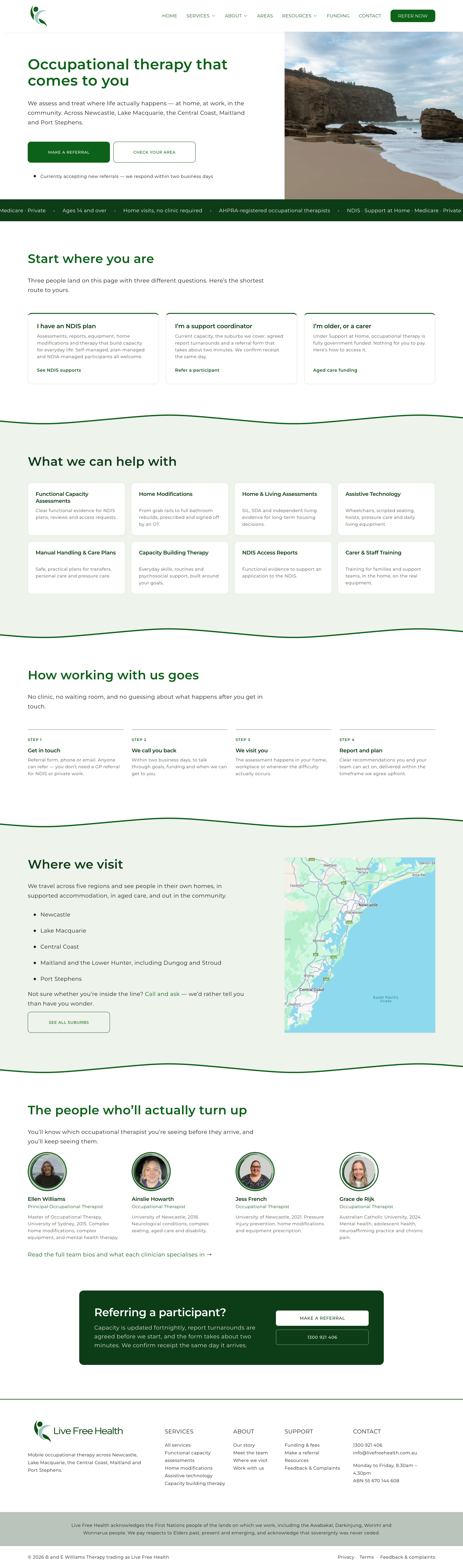
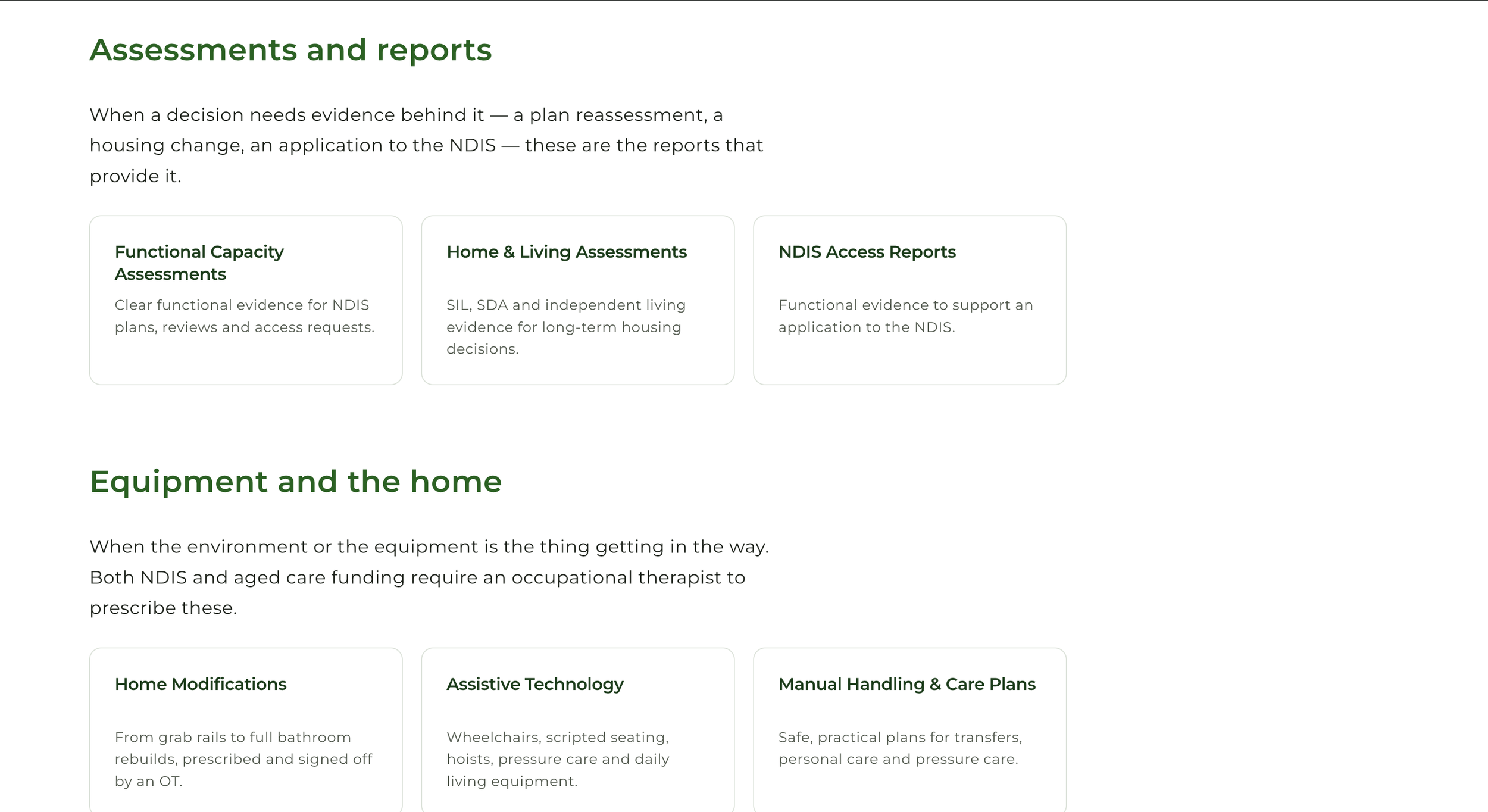
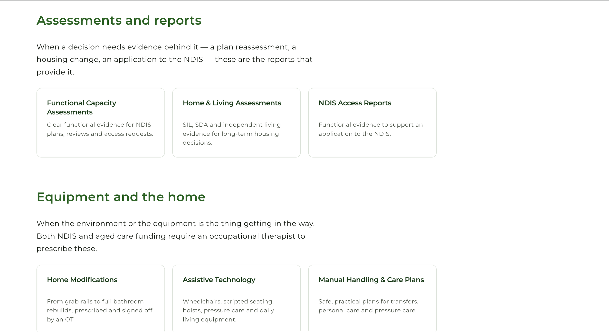
Eight service pages that can stand alone — functional capacity assessments, home modifications, assistive technology, manual handling and care plans, capacity building therapy, NDIS access reports, carer and staff training, and home and living assessments.
Funding treated as a real question — NDIS, Support at Home, Medicare and private, in plain language, on a page of its own.
A referral experience built for coordinators — because they send work to whoever makes their job easiest, so the site says up front exactly how easy it will be.
The team named and credentialled — university, year, and what each clinician specialises in, plus a promise you’ll keep seeing the same person.
Five service regions mapped — with an open invitation to ring and ask if you’re not sure you’re inside the line.
Titles, descriptions and page structure rebuilt for search — so each service can be found by the people looking for that specific thing.
The process spelled out in four steps — so nobody has to guess what happens after they make contact.
Analytics and Search Console connected — so from here, every decision has evidence behind it.
THE WORKAROUND
Promises instead of praise
With testimonials off the table, the site had to prove reliability rather than assert it. So it makes specific, checkable commitments — the sort a practice can be held to.
None of these are marketing claims. They’re operational facts, published where the people who care about them will see them.
For a support coordinator choosing between providers, this is more persuasive than any review could ever be.
When you can’t say you’re good, show how you work.
Named clinicians, published response times, agreed turnarounds and a process written down in full. Every one of them factual, checkable, and entirely within the rules.
A CLOSER LOOK
Inside the site
BEING STRAIGHT ABOUT IT
Why there are no numbers on this page
There aren’t any results to show yet, and that’s deliberate rather than evasive.
This site had no analytics at all before the rebuild — which was one of the findings that prompted it. Tracking went on at launch, so the measurement starts now rather than retrospectively. A quarter from now there will be real numbers, and they’ll be comparable against a proper baseline.
Anyone showing you a results graph for a site that’s been live a fortnight is showing you noise. I’d rather come back and update this page when there’s something worth reading.
SERVICES USED
What this involved
A note on this site. Ellen and her team can edit their own website — that’s rather the point. Some copy, imagery and layout may have changed since I finished the work. What’s described here is what I built and why.
Running a practice where half the usual marketing advice is off-limits?
Collect reviews, post client stories, show the transformation — none of it applies when you’re registered. There’s a way to build a website that earns trust without any of it. Tell me what you’re bound by and I’ll show you what’s left.